Marshall Mc Kinney
.01
Case Study
PHILADELPHIA MAGAZINE
BRAND REDESIGN
In early 2026, my studio was commissioned to redesign the Philadelphia magazine brand. From print to web to the logo itself, every element was up for rethinking. The timeline was ambitious, driven by the publisher’s desire to launch a fresh product in time for America’s Semiquincentennial, a milestone in which Philadelphia naturally plays a starring role. The incredibly talented Editor-in-Chief, CHRISTINE SPEER LEJEUNE specifically requested my services for this undertaking. After a brief consultation with her and Creative Director JAMIE LEARY—and a few tense laughs around the three and a half month tunrnaround time—we were off to the races. Gentlemen, start your engines!


The Sections


The Website

The Process
Opening Salvo
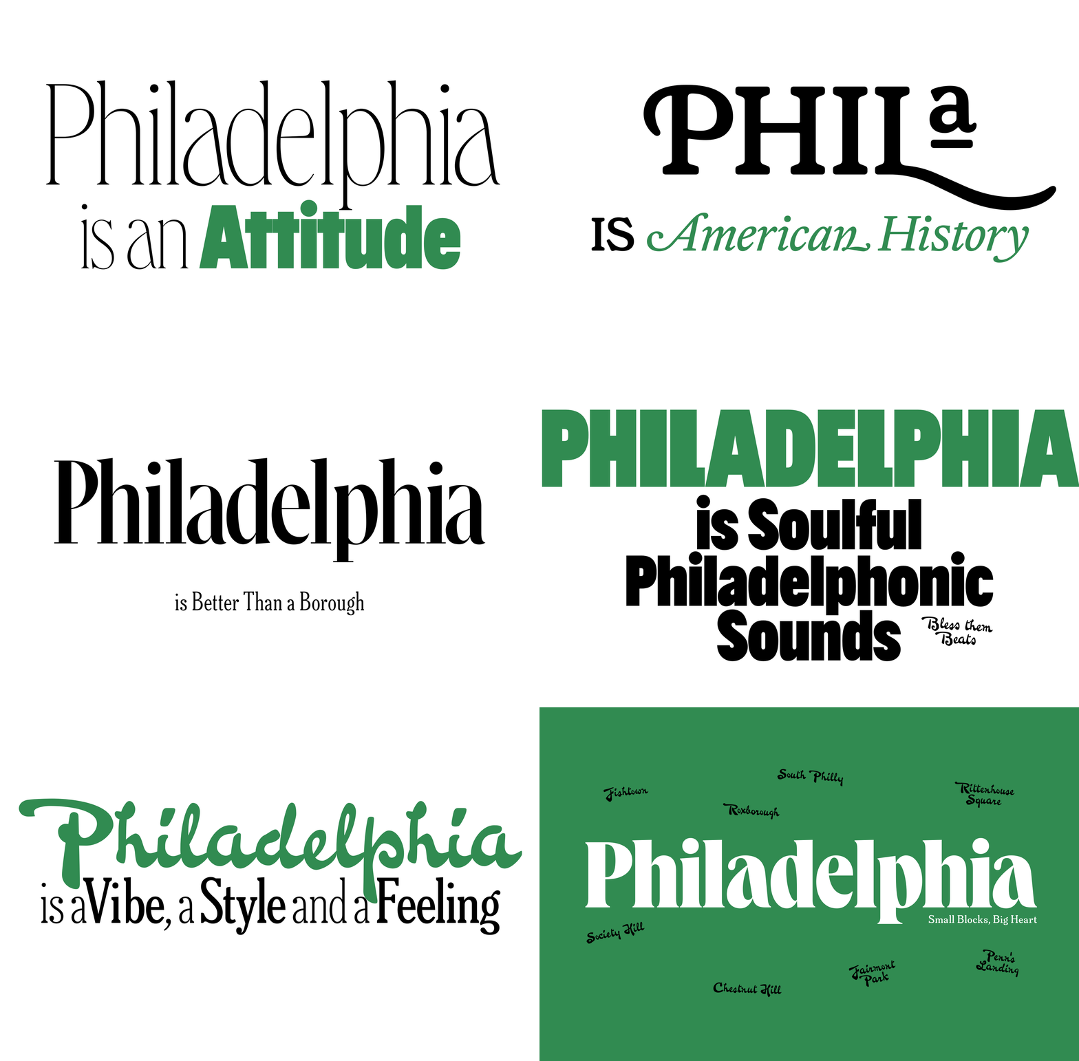
Philadelphia is a river city with soul, history, and unmistakable grit. It lives in its music, its foodways, its sports teams, its neighborhoods, and the stoop culture that keeps those neighborhoods well connected. Its people carry the city’s truest character: blue-collar pride, street-smart honesty, and a deep sense of belonging. It also has an earnest upper crust found in areas like Society Hill, Rittenhouse Square and Chestnut Hill. After some careful consideration via a deep typographic exploration of the city's visual traditions this (below) was one of the first things that popped out of me. Here, I'm trying to zero in on a type palette that might get at a balance point between Philly's blue collars and her bluebloods.
The Mission
Founded in 1908, Philadelphia magazine had more than a century of history behind it, but no clear mission statement to guide what came next. So I wrote one. It was meant to reflect the brand’s ambition and help define its purpose for the next 100 years. Mostly, though, I wrote it for myself: a guardrail against over-designing, over-explaining, or adding anything the brand didn’t need. No drag on the machine. No extras. No frills.
WE ARE A LOVE LETTER TO PHILLY.
Philadelphia magazine celebrates the people, places, history, foodways, cultures, and vibrant communities that hug the city center. Our aim is to honor the spirit and magic that underpin this brazenly independent and vibrant metropolis, one perpetually shaped by grit and self determination.
(We are going to become—not just the best city magazine—one of the most respected thought-leaders in the nation.)
And with that our work began in earnest.
The Covers
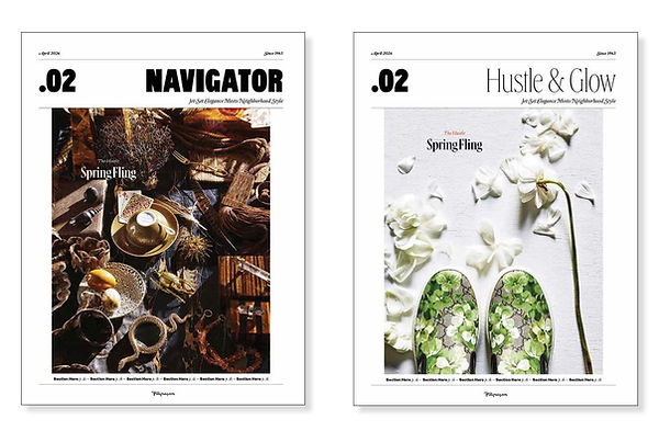
I began exploring logos that felt rooted in place, full of character, and unmistakably Philly. Personally, I feel like a city magazine's cover should really celebrate it's RISING CREATIVE CLASS and especially it's people. Here's a quick run of a few of the many, many covers that were prepped during the discovery process.


Logotype
After narrowing the logo direction to Queens Compressed Bold, I worked with Selma Losch, the typeface’s creator at Kilotype, to refine the letterforms into something original for Philadelphia magazine: a fresh one of a kind expression that Philly could call it's own.

TOCs
Below: Various proposed table of contents (TOC) approaches. My editor really wanted to try and fit all of the contents on one page, which I thought was an interesting challenge (see examples directly below), but after some careful consideration, and input from creative director Jamie Leary, we landed on a two-page TOC. One that would have the flexibility to combine the it with the magazine's contributors when needed.


Below: Examples of a two-page TOC along with contribs.


Section Openers and Departments
Below: Various proposed section openers. This part of the project was a lot of fun to ideate. As much for the visual problem solving as for the naming conventions that were tossed around.


After whipping up some 812 pages of ideas, explorations, and possible expressions in the discovery phase, we began to lock in and coax the brand into a rhythm that felt like a sweet groove. The early broad brushstrokes gave way to finer, more deliberate moves, and the work started to gather itself around a new typographic language, a clearer point of view, and a direction that felt unique, expressive and lively. One anchored in pride of place.


Department pages
Below: Various proposed department pages.


Columns and Essays
Below: Various proposed column pages.


